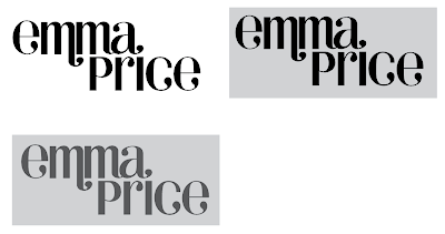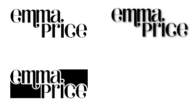

I started to think about how I could work the name into a more square shape so that it might be easier to apply to think like business cards etc so I tried to fill in the negative space. But I don't think it looks right.

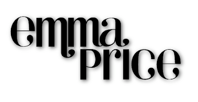
Adding a drop shadow to the original type has given it more depth and I think this could suffice for the website. It's probably not the quirky sort of idea that I was hoping to get but I think if I keep the identity simple I might be able to have more fun with what I start applying it to.

No comments:
Post a Comment