Tuesday 24 August 2010

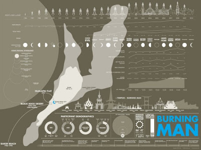
Selection of infographics, inspired by films


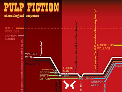
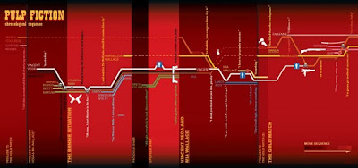
I want to look more at infographics, and these seem like a really good way of doing it. Taking the events of films and mapping them, almost like a timeline. This Pulp Fiction one is pretty interesting the way they've used a line for each of the characters and displays their stories.
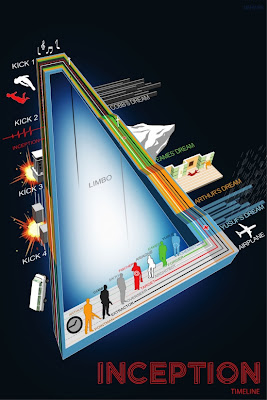


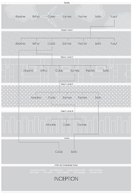
Inception, seems to be quite a complicated film to some people so using infographics to explain it to people seems like a good idea. Although I've seen inception a couple of times and I don't think I'd understand what this one was trying to say unless I'd understood the film to begin with. I agree that it's clever and a good illustration of the story, but I wonder whether the complicatedness of it is helpful or not. In comparison to the inception infographic below, I know which one I find easier to understand.
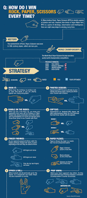


This is brilliant. And apparently it actually works. I can't get my head around it, so I'll stick to the cheating method of winning by slightly delaying my responses. But still, this is awesome.
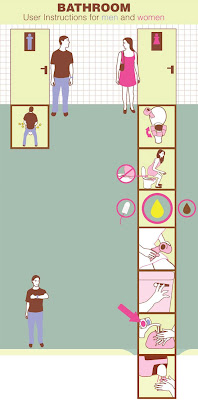


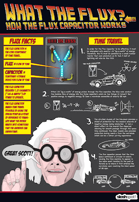
As is this. I really love these examples that clear and funny at the same time.


Friday 20 August 2010

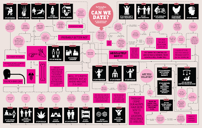
Flowcharts


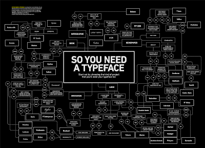
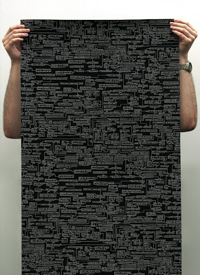
I've seen a few of these flow charts and I think they're really addictive. I can't help doing it once, and then start again and take different routes until I've read the entire thing. Some of the stuff on them is so funny as well, it seems like the perfect opportunity to take the piss out of people. Anyway, I was considering for one of my briefs to take problems from forums etc which are renowned for being ridiculous and try to answer them in a series of these flow charts, but I'm thinking that maybe they could be a good way to show my investigations of chance instead.

Saturday 7 August 2010

Update/personal identity

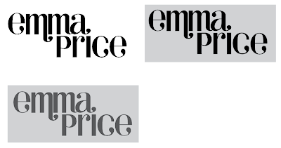
I've been doing a few sketches etc...but I'll have to upload them when I have access to a scanner or I can find my camera lead. Anyway, I've been developing the type for my personal identity. I'm pretty happy with what I've been working on. I decided to continue removing serifs from the typeface I was using before. And then been looking at the shape of my name.


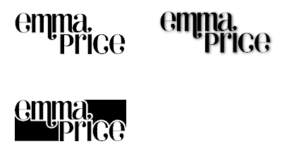
I started to think about how I could work the name into a more square shape so that it might be easier to apply to think like business cards etc so I tried to fill in the negative space. But I don't think it looks right.


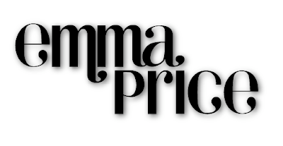
Adding a drop shadow to the original type has given it more depth and I think this could suffice for the website. It's probably not the quirky sort of idea that I was hoping to get but I think if I keep the identity simple I might be able to have more fun with what I start applying it to.