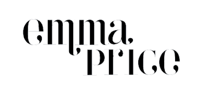
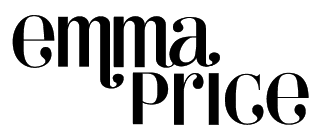
Here I've done a botch job of removing some of the serifs (basically all but the c) to see how this changes the weighting and the spacing. I've also tried to simplify the word into just simple shapes so that I can print them out and start to play with it a bit more on paper and develop the lettering more.


I wanted to see what my initials would look like together if I were to use this typeface. This is basically because I want to buy a wax seal for sealing post, and if I'm going to get it cast two intials will work better.
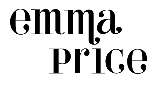
I quite like the idea of using a flourish to replace the dot of the 'i', as it helps to join the words together more. Although here, the spacing is still all wrong.
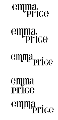
I found it really difficult to find an upper-case E that I actually liked so for now I'm working with the lower-case. I've been trying to work out the juxtaposition between my two names so that it looks more balanced. With the m's both being next to eachother it starts to look quite heavy, especially in comparison with 'price'.
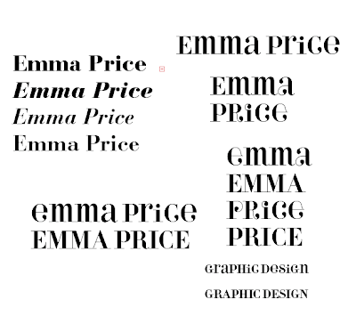
I then thought about using this type face, it seems quite quirky/fun but avoids looking cheap. There are a few things that annoy me about the typeface though, just as the stem of the 'i' being shortened and also the weight of some of the lines. I decided to use a mixture of the regular and the alternative fonts from the family as a basis.
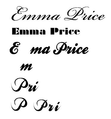
I started by looking at script typefaces. Previous feedback suggested that I should avoid doing something too dry and so I'm wary of this. A lot of the script typefaces look a bit 'floristy' which doesn't really reflect me. I think the key there is to find a weight that works.
No comments:
Post a Comment