Sunday, 26 September 2010

Friday, 24 September 2010
Umbrella Statement/Questions
To help define my design practice this year my umbrella statement stands as:
Information design, research driven, to a range of audiences across print screen and within an environment.
Talking through the groups wants and whys and our umbrella statements the following questions were raised which I need to address;
- [in relation to wanting to base work around my own interests] What am I interested in?
- Why not type and layout, what is it that I don't like?
- Do you want to collaborate with people who do type and layout? - learn skills from them?
- What aspects of screen are you interested in? web/motion? - do it yourself or propose?
- What environments/where are they? museums, factories etc?
Wants/Not wants and why
This year I would like to:
- collaborate with an interior design/architecture student so that I can explore more the relationship between graphic design and space
- develop my image skills in the context of delivering information to improve in clarity of communication
- use the briefs as an opportunity to learn about things I am interested in so that my portfolio is a reflection of my interests and also ties in things i want to learn anyway. This will help to make sure I am enjoying the work I'm doing.
- Base my design practice around informing people because I want to use my design skills in a way that helps others
- Design for a range of audiences within one brief so I can see how much this affects design
- Be more confident with type and layout so I don't feel restricted in what I can produce
- Look more at contextual references, within design and within the culture sector, as this will inform my design and make it more suitable for industry
- Identify studios that I'm interested in and visit them so I have some useful contacts when looking for employment
I don't want to:
- Produce work that aims to persuade people or change their opinion, as I don't feel comfortable in doing this
- Focus on layout/typography for publishing
- Do a branding/logo design brief
- Go into depth with investigating print methods
- Do overly commercial work
- Do ethically driven work
Saturday, 11 September 2010
Some of the things I've been looking at over summer:
Over the summer I've built up a collection of images that I find quite interesting and things that may inspire my briefs for next year, here's a selection of some of the things I've been looking at.
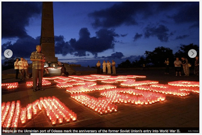
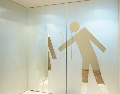
Playful use of pictograms, adding some sort of personality/charisma to something that is usually seen as inanimate and standardised.
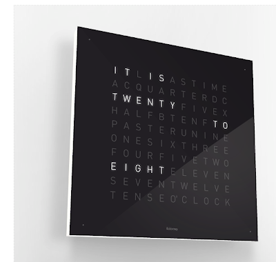
This, I thought was really clever. I've sat a couple of times trying to work out how many times it is able to display. I like that the normal format for a clock has been completely stripped and although still shown in a very mechanical and digital way, the language used is more human. I begin to think that it's not just a clock and that the clock is actually responding to something.

The way this makes use of floors and walls serves as a reminder to me the possibilities in design. Visually this piece is very beautiful, although the message is unclear.
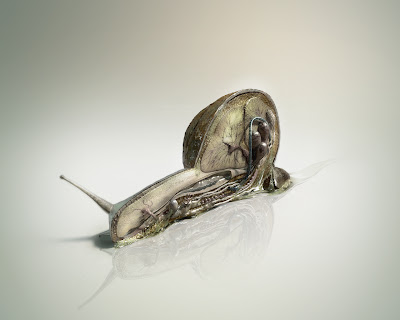
I'm not sure if this has any relevance to anything I'm interested in design wise, but it's just really interesting to see the anatomy of a snail. Something that on the surface looks like a very simple organism but clearly is understated.


Playful use of pictograms, adding some sort of personality/charisma to something that is usually seen as inanimate and standardised.

This, I thought was really clever. I've sat a couple of times trying to work out how many times it is able to display. I like that the normal format for a clock has been completely stripped and although still shown in a very mechanical and digital way, the language used is more human. I begin to think that it's not just a clock and that the clock is actually responding to something.

The way this makes use of floors and walls serves as a reminder to me the possibilities in design. Visually this piece is very beautiful, although the message is unclear.

I'm not sure if this has any relevance to anything I'm interested in design wise, but it's just really interesting to see the anatomy of a snail. Something that on the surface looks like a very simple organism but clearly is understated.

Going back to one of the type exercises we did, Graham asked us what drink we wanted to be. I wanted to be cherryade. I think changing the colour of my personal identity to something a bit more vibrant helps give it more fun.


I did think though it might be quite nice to have the black as a rollover image. These are the header designs for my site. Giving contact information.

The layout I began to use, making use of a menu and sub menu, a place for the images and a description to the right of it.

I decided however if I moved the description to below the image I could use a bigger image.

I then thought that the header was too distracting from the work, so I reduced the size of it.

At the moment I've done pretty much all of the content. I made numbers to flick through each of the images which change to lots of different colours, but now I think I'm going to have to change that. I don't like how the numbers and description move as you flick through images, due to the different heights of the images. To resolve this I either need to make all the images the same height, which isn't really practical for things that are portrait, move the numbers and description to a place that won't be affected or a third option is to get rid of the numbers and replace them with arrows for forwards or backwards.
At the moment I'm thinking of moving the description into the same column as the menu buttons or above the image and the same with the numbers. I'm unsure whether to replace them with arrows or not.
Sunday, 5 September 2010
Glennz Tee's


I've always loved this guys work, it's clever and instant. I love the tone of his work and it's something I'd like to have a go at myself. I think it's important that I develop my image skills this year, I think if I can start to explore more with image it'll help me get back into having more fun with visual things and will feed into everything else I'm doing. Hopefully it'll help me to start having more fun and feel more freedom with layouts. At the moment I feel too restricted, which I completely put upon myself.
Subscribe to:
Posts (Atom)