
Going back to one of the type exercises we did, Graham asked us what drink we wanted to be. I wanted to be cherryade. I think changing the colour of my personal identity to something a bit more vibrant helps give it more fun.


I did think though it might be quite nice to have the black as a rollover image. These are the header designs for my site. Giving contact information.
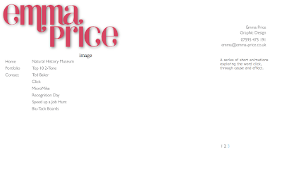
The layout I began to use, making use of a menu and sub menu, a place for the images and a description to the right of it.
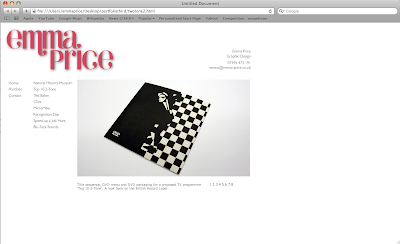
I decided however if I moved the description to below the image I could use a bigger image.
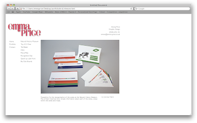
I then thought that the header was too distracting from the work, so I reduced the size of it.
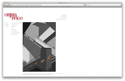
At the moment I've done pretty much all of the content. I made numbers to flick through each of the images which change to lots of different colours, but now I think I'm going to have to change that. I don't like how the numbers and description move as you flick through images, due to the different heights of the images. To resolve this I either need to make all the images the same height, which isn't really practical for things that are portrait, move the numbers and description to a place that won't be affected or a third option is to get rid of the numbers and replace them with arrows for forwards or backwards.
At the moment I'm thinking of moving the description into the same column as the menu buttons or above the image and the same with the numbers. I'm unsure whether to replace them with arrows or not.
No comments:
Post a Comment