Friday, 19 November 2010
Mark Howe

Tuesday, 12 October 2010
Tuesday, 5 October 2010
Business Card Development
Monday, 4 October 2010
Holmes Wood
Tuesday, 28 September 2010
Monday, 27 September 2010
Initial Statement of Intent/Rationale (to be reviewed)
During the last module of the second year it became apparent to me that my design practice was taking influence from the desire to help people. As a designer I don’t feel particularly comfortable with trying to persuade people to do things, to change, to buy into things. But rather, use my skills to help people do something that they already have an interest in.
This module is a chance for me to explore information design, for a range of audiences and contexts. I want to investigate further into designing for specific places, as well as design which can be used in a variety of different contexts without losing its meaning.
In the attempt to learn more about type and layout I have neglected image more than I would have liked to. I want to look more at image and how image can be used to inform.
As well as wanting to help people learn, I want to learn new things too. Portfolio feedback I received suggested that I use this year to show what my own interests are, and so subject wise I want to base briefs around my own interests or things that I want to know about.
I am also interested in developing my skills in design for digital/screen. I want to investigate the possibilities that technology allows in design, with considerations into movement, sound, interactivity and timing.
The briefs I intend on designing for should be diverse in how information is communicated. Rather than be specific to one area of information design, it’s important to me that they span across different formats and are used by different audiences.
At least one of the briefs will be based on way finding and environmental graphics, looking at signs and mapping for a specific place and thinking about how people move around an area and interact with the information within the place.
As well as environmental I want to produce work across both print and screen, and examine how each can be used in the delivery of information. Image in particular is important for me to investigate and so the briefs I do should consider how image is used as both still image and as moving image.
I want to become confident in web design, and so where suitable web should be considered for deliverables. I intend to use the workshops available to develop these skills, as I feel it will make me more employable.
Sunday, 26 September 2010
Friday, 24 September 2010
Umbrella Statement/Questions
Wants/Not wants and why
Saturday, 11 September 2010
Some of the things I've been looking at over summer:
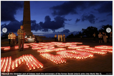
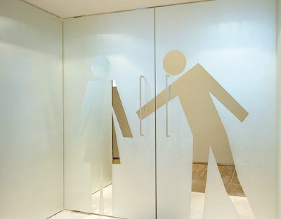
Playful use of pictograms, adding some sort of personality/charisma to something that is usually seen as inanimate and standardised.
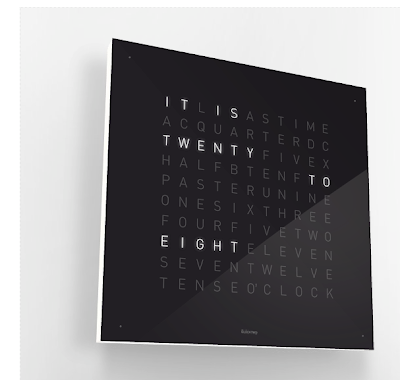
This, I thought was really clever. I've sat a couple of times trying to work out how many times it is able to display. I like that the normal format for a clock has been completely stripped and although still shown in a very mechanical and digital way, the language used is more human. I begin to think that it's not just a clock and that the clock is actually responding to something.
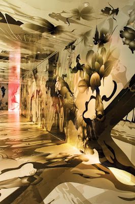
The way this makes use of floors and walls serves as a reminder to me the possibilities in design. Visually this piece is very beautiful, although the message is unclear.
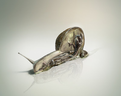
I'm not sure if this has any relevance to anything I'm interested in design wise, but it's just really interesting to see the anatomy of a snail. Something that on the surface looks like a very simple organism but clearly is understated.
Going back to one of the type exercises we did, Graham asked us what drink we wanted to be. I wanted to be cherryade. I think changing the colour of my personal identity to something a bit more vibrant helps give it more fun.


I did think though it might be quite nice to have the black as a rollover image. These are the header designs for my site. Giving contact information.
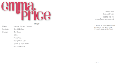
The layout I began to use, making use of a menu and sub menu, a place for the images and a description to the right of it.
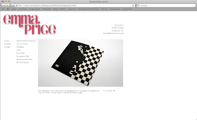
I decided however if I moved the description to below the image I could use a bigger image.
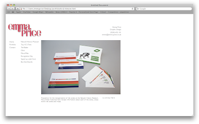
I then thought that the header was too distracting from the work, so I reduced the size of it.
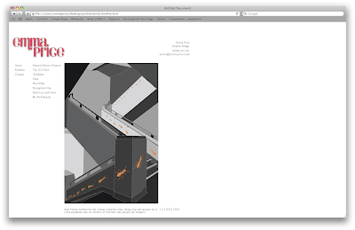
At the moment I've done pretty much all of the content. I made numbers to flick through each of the images which change to lots of different colours, but now I think I'm going to have to change that. I don't like how the numbers and description move as you flick through images, due to the different heights of the images. To resolve this I either need to make all the images the same height, which isn't really practical for things that are portrait, move the numbers and description to a place that won't be affected or a third option is to get rid of the numbers and replace them with arrows for forwards or backwards.
At the moment I'm thinking of moving the description into the same column as the menu buttons or above the image and the same with the numbers. I'm unsure whether to replace them with arrows or not.
Sunday, 5 September 2010
Glennz Tee's
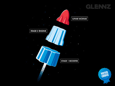
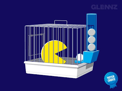
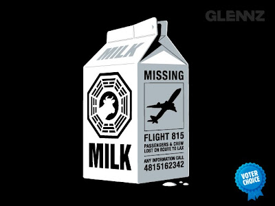
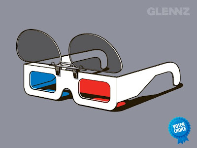
I've always loved this guys work, it's clever and instant. I love the tone of his work and it's something I'd like to have a go at myself. I think it's important that I develop my image skills this year, I think if I can start to explore more with image it'll help me get back into having more fun with visual things and will feed into everything else I'm doing. Hopefully it'll help me to start having more fun and feel more freedom with layouts. At the moment I feel too restricted, which I completely put upon myself.
Tuesday, 24 August 2010
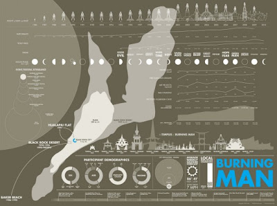
Selection of infographics, inspired by films
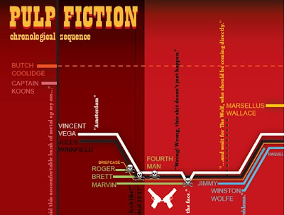
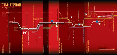
I want to look more at infographics, and these seem like a really good way of doing it. Taking the events of films and mapping them, almost like a timeline. This Pulp Fiction one is pretty interesting the way they've used a line for each of the characters and displays their stories.
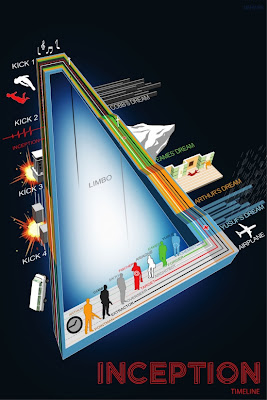
Inception, seems to be quite a complicated film to some people so using infographics to explain it to people seems like a good idea. Although I've seen inception a couple of times and I don't think I'd understand what this one was trying to say unless I'd understood the film to begin with. I agree that it's clever and a good illustration of the story, but I wonder whether the complicatedness of it is helpful or not. In comparison to the inception infographic below, I know which one I find easier to understand.
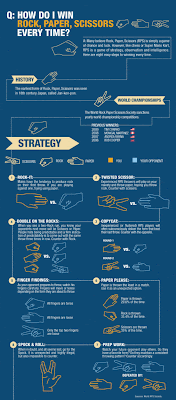
This is brilliant. And apparently it actually works. I can't get my head around it, so I'll stick to the cheating method of winning by slightly delaying my responses. But still, this is awesome.
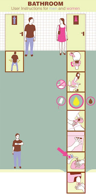
As is this. I really love these examples that clear and funny at the same time.
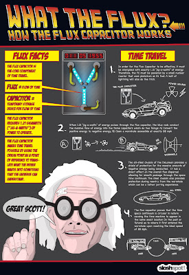
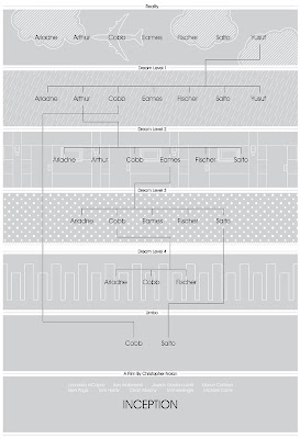


Friday, 20 August 2010
Flowcharts
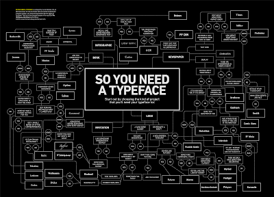
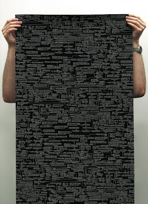
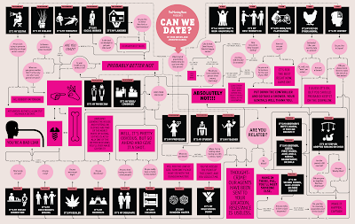
I've seen a few of these flow charts and I think they're really addictive. I can't help doing it once, and then start again and take different routes until I've read the entire thing. Some of the stuff on them is so funny as well, it seems like the perfect opportunity to take the piss out of people. Anyway, I was considering for one of my briefs to take problems from forums etc which are renowned for being ridiculous and try to answer them in a series of these flow charts, but I'm thinking that maybe they could be a good way to show my investigations of chance instead.
Saturday, 7 August 2010
Update/personal identity
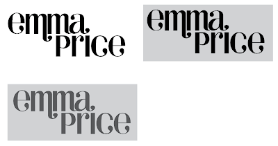
I started to think about how I could work the name into a more square shape so that it might be easier to apply to think like business cards etc so I tried to fill in the negative space. But I don't think it looks right.
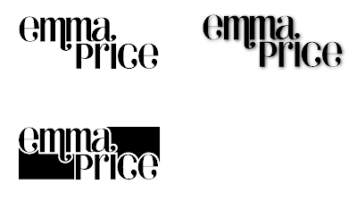
Adding a drop shadow to the original type has given it more depth and I think this could suffice for the website. It's probably not the quirky sort of idea that I was hoping to get but I think if I keep the identity simple I might be able to have more fun with what I start applying it to.
Wednesday, 28 July 2010
self promotion
Here I've done a botch job of removing some of the serifs (basically all but the c) to see how this changes the weighting and the spacing. I've also tried to simplify the word into just simple shapes so that I can print them out and start to play with it a bit more on paper and develop the lettering more.


I wanted to see what my initials would look like together if I were to use this typeface. This is basically because I want to buy a wax seal for sealing post, and if I'm going to get it cast two intials will work better.
I quite like the idea of using a flourish to replace the dot of the 'i', as it helps to join the words together more. Although here, the spacing is still all wrong.
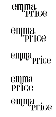
I found it really difficult to find an upper-case E that I actually liked so for now I'm working with the lower-case. I've been trying to work out the juxtaposition between my two names so that it looks more balanced. With the m's both being next to eachother it starts to look quite heavy, especially in comparison with 'price'.
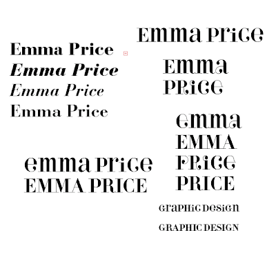
I then thought about using this type face, it seems quite quirky/fun but avoids looking cheap. There are a few things that annoy me about the typeface though, just as the stem of the 'i' being shortened and also the weight of some of the lines. I decided to use a mixture of the regular and the alternative fonts from the family as a basis.
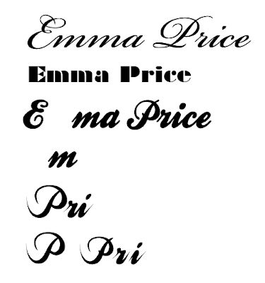
I started by looking at script typefaces. Previous feedback suggested that I should avoid doing something too dry and so I'm wary of this. A lot of the script typefaces look a bit 'floristy' which doesn't really reflect me. I think the key there is to find a weight that works.

